How to Make a Single Div Logo
In this short article, I'll show you how to make a single div logo just using CSS!
October 23, 2020 (6y ago)
5 min read
I love making CSS art; it's one of the best ways to grow your skills - making dynamic-column layouts can only teach you so much.
In this short article, I want to show you how I made this single div logo just using CSS. Feel free to create a pen over on CodePen and follow along!

Getting Started
Before we jump into any code, check out Mihai Dolganiuc on Dribbble - the logo we're building is based off one in his collection.
The first thing that I like to do when creating a new pen is define the colors I'll be using, set a nice background color and center my canvas. I'm using SCSS in this example, but you could use CSS variables if you'd like.
$background: #ebf5fc;
$light-blue: #00cdfc;
$dark-blue: #007fe8;

body {
  display: flex;
  min-height: 100vh;
  justify-content: center;
  align-items: center;
  background: $background;
}
This gives us a nice off-white color and ensures that any markup we add (coming up next) will be centered on the screen.
Alright! Let's add our single div to the HTML. I'll apply a class name of logo so we can target that in our CSS.
<div class="logo"></div>
Thinking Through the Problem
Now comes the fun part. The only way I can think of easily achieving this effect is by using a Pseudo-Element. A Pseudo-Element allow you to style specific parts of an element. While there are many Pseudo-Element selectors, the ::before selector will allow us to add content before an element. In our case, we can utilize the ::before selector to layer the rounded-square on top of the blue circle.
Putting It All Together
Now that we have a solution, let's start to put everything together. Let's start with the blue circle.
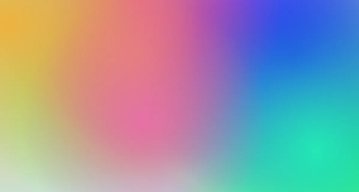
.logo {
  width: 150px;
  height: 150px;
  border-radius: 50%;
  // 1
  background: linear-gradient(to bottom left, $dark-blue 15%, $light-blue);
  // 2
  position: relative;
}
There are a few important things here that I want to point out.
-
We use a linear-gradient to fill the circle. This gives us a nice fade between the darker blue and the lighter blue. The 15% will start the darker-blue further into the gradient, giving it a more dominant appearance.
-
Because we're going to use a Pseudo-Element for the rounded-square, we need to ensure that we can position that element based off of the position of the circle. That's why we use
position: relativehere.
The CSS above gives us the follow result:

Now that the easy part is out of the way, let's start to work on the rounded-square.
First, target the ::before selector. Because I'm using SCSS, I can nest this selector inside my class selector.
.logo {
  ... &::before {
  }
}
The ::before selector won't do anything as-is; we need to set the content, position, background and size of the element first.
&::before {
  // 1
  content: "";
  // 2
  position: absolute;
  // 3
  bottom: 60px;
  left: 60px;
  width: 150px;
  height: 150px;
  background: #ea2f98;
}
-
Because we're using the
::beforeselector, we need to include thecontentproperty. This property is used to add content to the element, and in our case, we just set it equal to an empty string. If thecontentproperty is excluded from this rule, the element won't show up at all. -
Because we set the circle's
positiontorelativewe can now position this rounded-square based off of the circle by settingposition: absolutehere. -
We move this element 60px from the bottom and 60px from the left of the blue circle.

It's starting to get there - very nice! Let's get those rounded corners in there and get that stroke effect by using a border.
&::before {
    ...
    border-radius: 60px;
    border: 12px solid $background;
  }

At this point, we've pretty much achieved the desired effect. The last major step is to apply the gradient.
Revisit the background property and use a linear-gradient instead of the pink color.
In order for the blue circle to show through the rounded-square, we need to have the bottom-left of the square be slightly translucent. We achieve this by using rgba() and setting the alpha to 0.8.
&::before {
    ...
    background: linear-gradient(
      to bottom left,
      rgba(249, 180, 70, 1) 15%,
      rgba(234, 47, 152, 0.8)
    );
    ...
  }

Because we're using a Pseudo-Element and are offsetting it from the circle, the entire logo is now off-center. To fix this, we can simply go back to the .logo rule and add some margin.
.logo {
  margin: 100px 100px 0 0;
  ...;
}

Conclusion
There we go - we've created a single div logo with the assistance of a Pseduo-Element and some gradients! It really wasn't that difficult was it?
Here's the final result:
I'm sure there are other ways to achieve this effect - let me know your approach in the comments below!
Thanks for reading! If you liked this article and want more content like this, read some of my other articles and make sure to follow me on Twitter!
Here are some other articles you might find interesting.
Creating the JAMstack logo with CSS - A Step-By-Step Guide
Learn how to break complex objects into simple shapes and build the JAMstack logo with CSS!
Tailwind Gradients - How to Make a Glowing Gradient Background
In this article, you’ll learn all about Tailwind gradients and how to create the popular glowing gradient effect.

Subscribe to my newsletter
A periodic update about my life, recent blog posts, how-tos, and discoveries.
NO SPAM. I never send spam. You can unsubscribe at any time!
